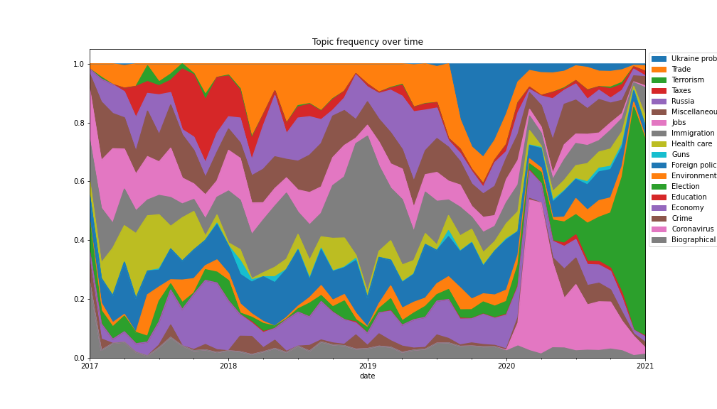
Task: Given a list of topics and date posted generate a visualisation to illustrate topic relative prevalence over time.
So I want you to generate something like the following. Notice the progression of the corona virus, and later the election.
date by months (otherwise data is too noisy).date and cateegory and then rest_index.plot.area in reverse order.Scroll down for solution
Step 1:
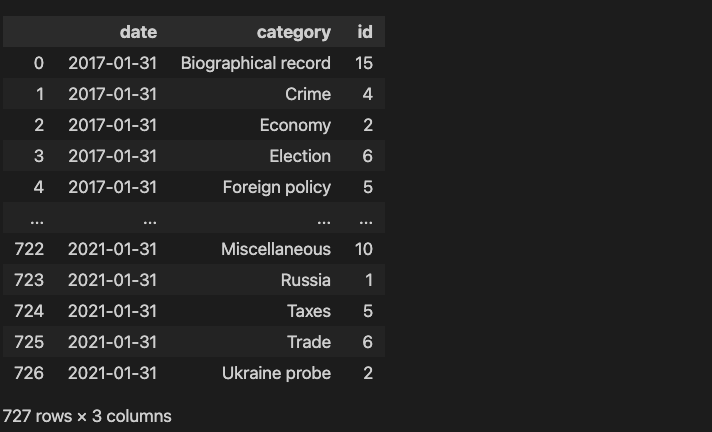
Group the data by month and category. The grouping by month is more difficult since the date column is in days. However pandas has functions to deal with dates, for example to group columns date by month we use pd.Grouper(key='date', freq='1M').
1 2 3 4 | |
which results in a dataframe containing the count of each category by month:
Step 2:
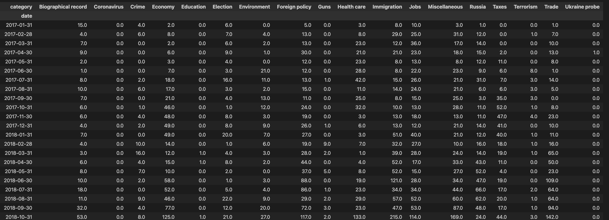
Pivot the column category so that each category label is a separate column:
1 2 3 | |
which results in the following cross table. Note the filling of missing values by zero.
Step 3:
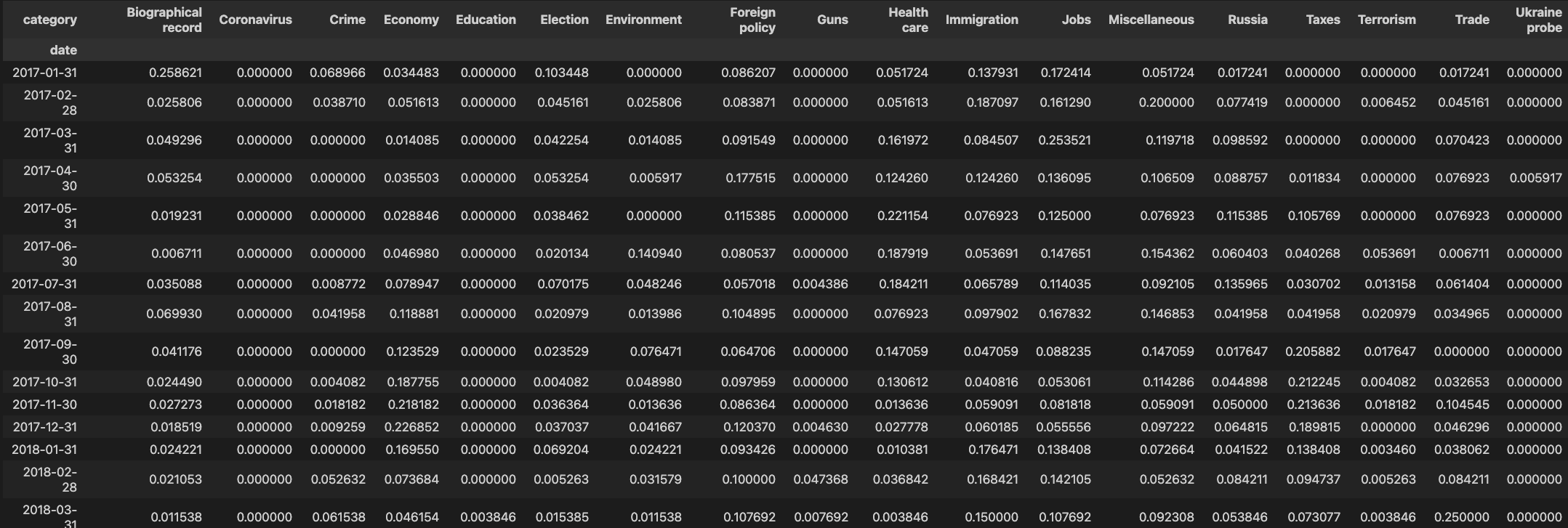
We want to divide each row by the sum of occurrences (frequencies) in each row
1 2 3 | |
so we have
Step 4:
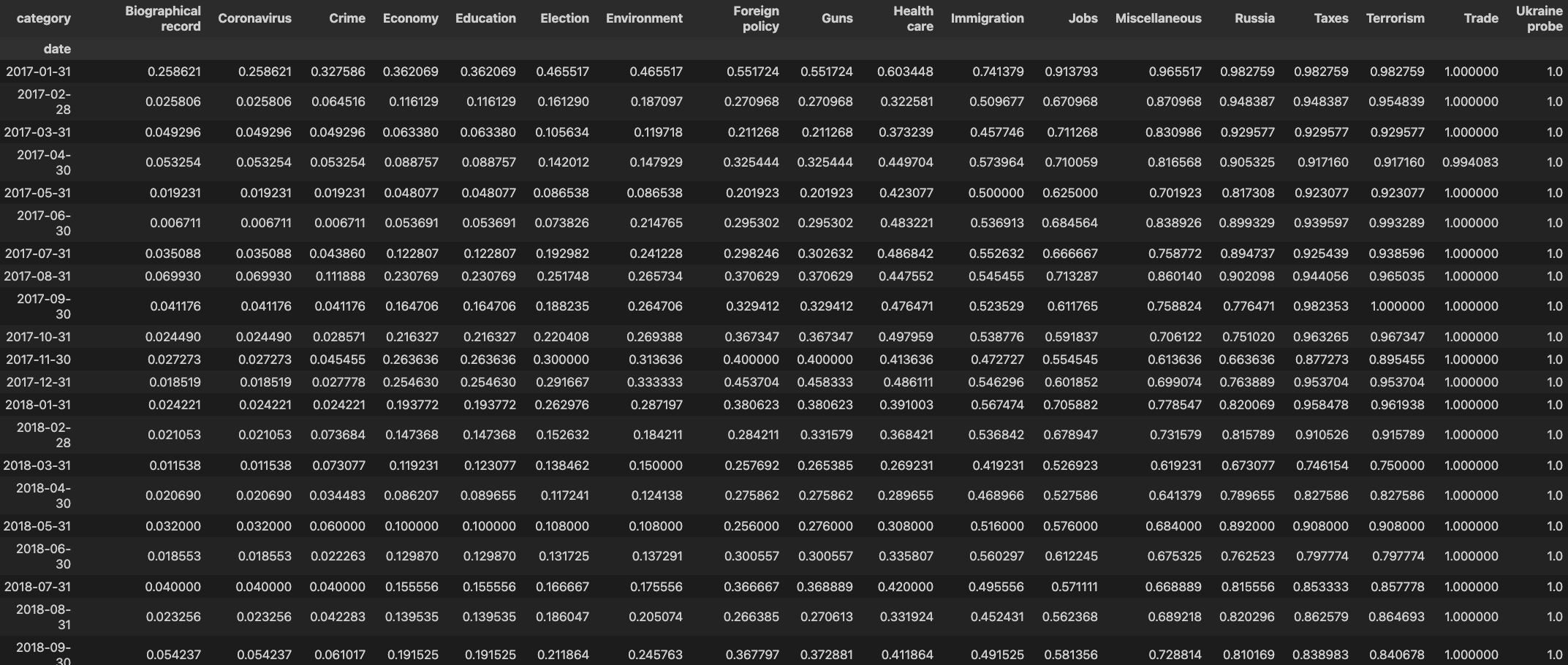
We want to calculate the cumulative sum along each row:
1 2 3 | |
so we have
Step 5:
Finally, generate the plot. We draw the topics in reverse order so that each topic area is visible.
1 2 3 4 5 6 7 | |